
 James
James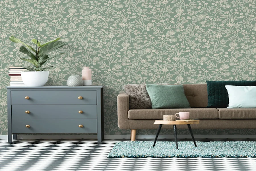
People usually start with the print. A floral feels charming. A stripe looks clean. A mural looks dramatic. Then the sample comes home, and suddenly the print is not the issue. The color is wrong.
Maybe the floor is warmer than expected. Maybe the trim is cream, not white. Maybe the sofa makes the whole background look dull. That is why the wallpaper color palette should come before the final choice. For anyone choosing wallpaper for walls around an existing room, color is the thing that decides whether the wallpaper belongs there.
- Why Color Palette Matters More Than Pattern or Style
- Building a Color Palette Before You Shop for Wallpaper
- Matching Wallpaper to Warm Color Palettes
- Matching Wallpaper to Cool Color Palettes
- Matching Wallpaper to Neutral and Monochrome Palettes
- Matching Wallpaper to Bold or Colorful Palettes
- Tools and Techniques for Testing Color Matches Before Committing
- Mistakes to Avoid When Matching Wallpaper to a Color Palette
- Conclusion
Why Color Palette Matters More Than Pattern or Style
Pattern gets attention, but color changes the room first. A blue print can look calm in one bedroom and cold in another. Beige can feel soft near wood, then flat beside gray fabric. Green can look fresh online and strange next to the curtains.
This is why matching wallpaper to color scheme is not the same as finding the exact same shade. Exact matching can look stiff, like everything was bought from one display corner.
A better room usually has some breathing room. One color repeats. Another color softens the space. A small contrast keeps it from looking flat.
Building a Color Palette Before You Shop for Wallpaper
Start with the things that are staying. Floor, trim, cabinets, tile, stone, built ins, and large furniture are not small details. They set the rules before the wallpaper even enters the room.
After that, look at the softer pieces. Rugs, bedding, curtains, cushions, lampshades, art. Sometimes the right wallpaper color is already there in a tiny thread, a painted frame, or the darker part of a rug.
The 60 30 10 rule can help, but loosely. Main color, support color, accent color. That is enough. Wallpaper can be any of those, but it should not arrive as a new random shade with no connection to the room.
Matching Wallpaper to Warm Color Palettes
Warm rooms usually have cream, beige, tan, clay, rust, terracotta, honey wood, camel, or brass. A wallpaper for warm color scheme should stay close to that warmth.
Earthy botanicals, faded landscapes, soft stripes, plaster textures, and stone style prints often work well. Olive, dusty rose, muted gold, and soft brown can also fit if the room already leans warm.
The problem is usually undertone. Blue gray wallpaper beside honey wood can look accidental. Bright white next to cream trim can feel too sharp. In warm rooms, softness often works better than a strong contrast.
Matching Wallpaper to Cool Color Palettes
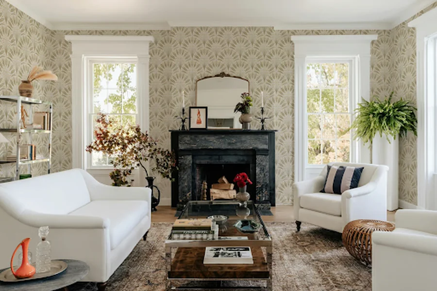
Cool rooms usually sit around gray, blue, sage, black, charcoal, white, or soft green. They can look calm, but sometimes too quiet.
Muted prints help. Misty murals, blue gray botanicals, pale stone, sage patterns, gray on gray texture, and soft geometric designs can support the room without making it feel busy.
Cream and beige need checking here. Beside cool gray or crisp white trim, they can turn yellow. This is where how to choose wallpaper color becomes practical. The right sample is not the prettiest one online. It is the one that survives the actual room.
Matching Wallpaper to Neutral and Monochrome Palettes
Neutral rooms do not need loud wallpaper. They need movement. A wallpaper for neutral palette can add texture, shadow, or a quiet repeat without changing the whole mood.
Taupe on beige. Warm white on cream. Gray on gray. Soft brown on linen. Small shifts are enough when the furniture and light already feel calm.
One accent color can work too, but keep it small. Olive, rust, dusty blue, charcoal, or muted gold is plenty. Repeat it once in a cushion, vase, frame, throw, or lamp base. More than that can start to look too arranged.
Matching Wallpaper to Bold or Colorful Palettes
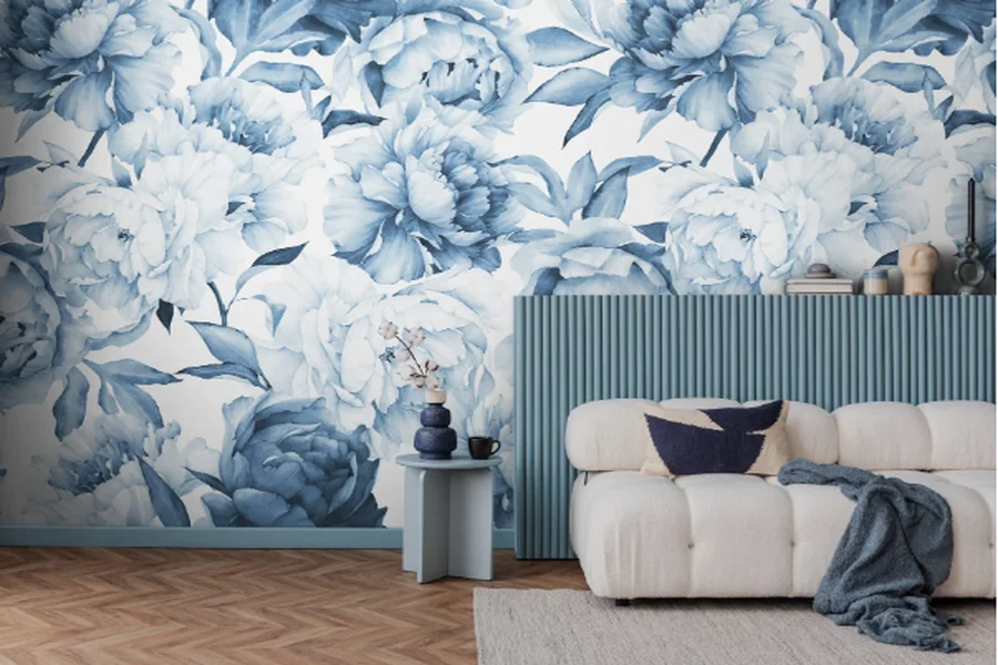
A colorful room does not need wallpaper that repeats every color in it. That usually makes the wall look nervous.
If the rug, sofa, art, or curtains already carry strong shades, choose one dominant color and let the wallpaper echo it. Not five colors. One.
Wallpaper can lead when the furniture is simple. A hallway, dining nook, powder room, or headboard wall can handle a stronger print. In a room with loud textiles and colorful art, the wallpaper should calm things down.
For wallpaper for color palette work in bold rooms, choose one repeated color and one neutral base. That gives the eye somewhere to rest.
Tools and Techniques for Testing Color Matches Before Committing
A sample can fool you on a screen. It can also fool you in your hand. Put it beside the things it will actually live with.
Hold it near the floor, trim, sofa, bedding, cabinets, rugs, and curtains. Check it in daylight and again at night. Green can turn gray. White can look too sharp. Beige can go yellow under a warm bulb.
A phone photo can help when the room feels confusing. Use a digital color picker on a rug, painting, or fabric to see what colors are already there. It is not perfect, but it gives you a place to start.
This is the boring part of any wallpaper selection guide, but it prevents the most common mistake: choosing a pretty sample for the wrong room.
Mistakes to Avoid When Matching Wallpaper to a Color Palette
Avoid:
- choosing wallpaper before checking the floor and trim
- matching every color too literally
- ignoring warm and cool undertones
- testing samples only at night
- adding a new accent color the room does not need
- assuming white, gray, beige, or cream will automatically match
- choosing a print that tries to repeat every color in the room
A wallpaper should not look separate from the space. It should feel like it had a reason to be there.
Conclusion
A clear palette makes wallpaper easier to choose. It cuts down the options and keeps a good print from feeling out of place.
Test the sample against real light, real furniture, real flooring, and real trim. When those colors sit together naturally, the room feels finished without looking forced.
