
 James
James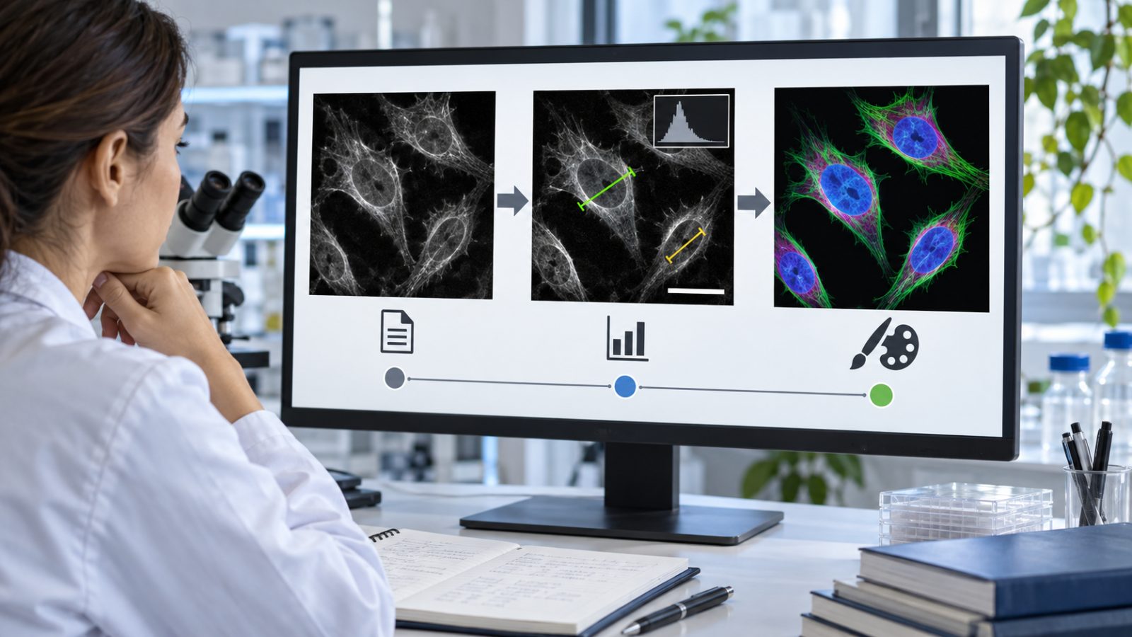
A microscope frame can serve two very different jobs. In an analysis folder, it records what the instrument captured. In a presentation, it may help a reader understand shape, location, or scale. Trouble begins when a visually improved illustration quietly replaces the analytical source.
An AI image tool may help prepare a communication graphic, but it should not touch the measurement path. Enhancement can change boundaries, remove small objects, or invent texture that looks like signal. Research teams need separate source, analysis, and illustration tracks.
PicEditor AI includes enhancement, upscaling, object removal, background, color, and image-to-image workflows. Those are publishing tools in this setting. They do not validate a microscope, preserve quantitative intensity by default, or turn generated detail into observation.
- Define Three Image Tracks Before Editing Begins
- Make Every Source File Read Only
- Write Analysis Rules Before Seeing The Preferred Result
- Compare Analytical Enhancement With Generative Illustration
- Use The Same Rule Across Comparable Frames
- Route Explanatory Graphics To A New File
- Keep Scale And Orientation Outside Generated Areas
- Compare The Analysis File With The Illustration
- Toggle Every Boundary At Full Resolution
- Recalculate Claims From The Analysis Track
- Label Illustrative Changes Where Readers See Them
- Know The Limits Of Generative Research Graphics
Define Three Image Tracks Before Editing Begins
The source track contains camera or instrument files exactly as captured. The analysis track contains documented transformations allowed by the method, such as calibration, registration, or a fixed contrast rule. The illustration track contains crops, arrows, color choices, layout, and any generative change used only for explanation.
Make Every Source File Read Only
Copy them into a controlled folder, retain original names and metadata, and calculate a checksum when the project requires traceability. Do not open and resave the only copy. Every later file, including an AI Photo Editor illustration, should point back to one source identifier.
Write Analysis Rules Before Seeing The Preferred Result
Choose crop policy, channel handling, background subtraction, thresholds, and contrast limits before selecting the most persuasive frame. Applying different settings to treatment and control images can create a visual difference that the experiment did not produce.
| Track | Permitted purpose | Not permitted |
| Source | Preserve instrument capture | Overwrite or cosmetic cleanup |
| Analysis | Run documented quantitative method | Selective local enhancement |
| Illustration | Explain location or concept | Serve as measurement evidence |
Separate tracks protect both rigor and clear communication. A team can make a clear figure without pretending that every explanatory pixel came from the instrument.
Put track names in the filename rather than relying on folder location alone. Files move into email, slide decks, and shared drives. A suffix such as source, analysis, or illustration keeps the status visible after that move and reduces the chance that a polished graphic returns to the measurement folder.
Record software, version, parameters, and operator for the analysis track. For the illustration track, record the source identifier and every change that alters pixels. The two logs serve different goals: reproducibility for analysis and transparent communication for the derivative.
Compare Analytical Enhancement With Generative Illustration
Analytical processing follows a stated method and should be repeatable on comparable data. Generative editing predicts plausible content from patterns. Both may change appearance, but only the first belongs in a measurement pipeline when the method supports it.
Use The Same Rule Across Comparable Frames
If contrast is increased, apply the same transformation to control and treatment images. Keep scale bars and channel labels in conventional overlays. Do not use a local mask to brighten the region that best supports the hypothesis.
Route Explanatory Graphics To A New File
When you edit a photo for a talk, duplicate the approved analysis figure and mark the copy as illustrative. Add arrows, color coding, or a simplified background there. Keep generative illustrations separate from observational figures and check the destination’s rules before creating them. Some publishers prohibit generated images even when labeled; a separate file and disclosure do not override that restriction.
Keep Scale And Orientation Outside Generated Areas
A generated extension cannot support a scale bar. Crop to observed pixels or use a plain canvas around the image. Record rotations and flips, especially when left-right orientation has scientific meaning.
An AI Photo Editor is useful for layout exploration, not quantitative recovery. Upscaling may make edges appear smoother, but it cannot add measured resolution. When a feature is below the source limit, describe that limit instead of presenting predicted detail as a closer observation.
When several channels are combined, keep single-channel views available. False color can help readers distinguish signals, but a generative palette or blended background may hide overlap and saturation. Choose colors in a conventional graphics step and ensure the legend describes the actual mapping.
Do not remove dust, bubbles, debris, or outliers from a research image merely because they look distracting. First determine whether the method treats them as artifacts and document that rule. Selective cleanup after seeing the result can shift counts and boundaries.
Compare The Analysis File With The Illustration
Place the two files side by side and list every difference. Crops, arrows, false color, background removal, labels, and reconstructed regions should all appear in the change record. A reviewer should be able to identify which pixels remain observational.
Toggle Every Boundary At Full Resolution
Align the images and inspect edges around cells, bands, particles, lesions, or other study-specific features. If the illustration adds or removes a boundary, its caption must not imply that the change was measured.
Recalculate Claims From The Analysis Track
Numbers, counts, areas, intensities, and classifications must come from the approved analytical data, never the presentation copy. Re-run the calculation from its inputs before final publication. The figure should communicate the result, not generate it.
Label Illustrative Changes Where Readers See Them
State that the image is a schematic, enhanced illustration, or generative visualization in the figure caption. Keep a link to the method and source record inside the publication system. A distant production note is not enough when the graphic could be read as evidence.
PicEditor AI can help make the illustration easier to follow after the evidence boundary is locked. A photo editor AI output should never flow backward into the analysis folder or replace a source image on the assumption that it simply looks clearer.
Ask a reviewer to trace one claim backward from the figure to the analysis result and then to the source file. The path should work without relying on memory. If the reviewer lands on an illustration when looking for the measured data, rename or relocate the files before publication.
Teams may edit a photo for recruitment, public outreach, or a graphical abstract. In those uses, PicEditor AI can simplify context or improve layout, provided the destination permits that use and both the caption and internal record identify the result as illustrative. Keep a direct route to the unaltered observation for anyone evaluating the claim.
Know The Limits Of Generative Research Graphics
Do not use generative changes for primary measurements, diagnostic interpretation, regulatory evidence, or any result where pixel provenance matters. Use the source and documented analysis pipeline, with appropriate review for the field.
The same boundary applies to training examples and model evaluation sets. Reconstructed texture, erased artifacts, or relabeled regions can alter what a later system learns. Keep generated illustrations out of datasets unless the research design explicitly studies synthetic data and records that provenance.
For public communication, pair the illustrative graphic with a plain explanation of what was measured. Readers should be able to distinguish the observed result, the analytical method, and the visual device used to explain it. Readers get a clear explanation without being asked to inspect raw instrument files.
Keep the tracks separate, derive claims from analysis, and label illustrations at the point of use. That boundary lets researchers explain complex images without confusing a communication aid with an observation.
