
 James
James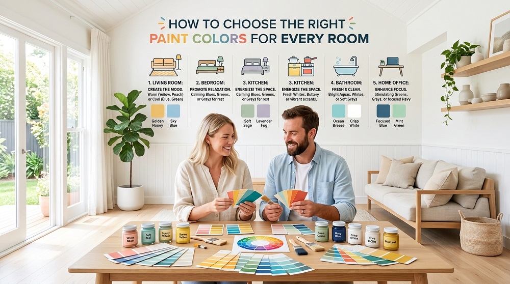
Choosing paint colors often feels more overwhelming than it should, given how many variables—lighting, room size, existing furniture, personal taste—all factor into a single decision. Breaking the process down room by room, with a few core principles in mind, makes the choice far less intimidating.
- Understand the Basics Before Picking a Color
- Test Colors in the Actual Room
- Consider Natural and Artificial Lighting
- Choosing Colors for Living Rooms
- Balancing Warmth and Versatility
- Consider the Room’s Primary Use
- Selecting Colors for Bedrooms
- Prioritizing Calm Over Statement
- Avoid Overly Stimulating Tones
- Picking Kitchen and Dining Room Colors
- Colors That Support Appetite and Energy
- Practical Considerations for High-Traffic Areas
- Choosing Bathroom Colors Thoughtfully
- Working With Limited Natural Light
- Moisture-Resistant Finishes Matter
- Selecting Colors for Home Offices
- Supporting Focus and Productivity
- Balancing Energy and Calm
- General Principles That Apply Everywhere
- Consider Flow Between Connected Spaces
- Undertones Matter More Than the Color Name
- When in Doubt, Choose Adaptable Neutrals
- Making a Confident Final Decision
Understand the Basics Before Picking a Color
Test Colors in the Actual Room
Paint chips and online swatches rarely reflect how a color will actually look once applied, since lighting and surrounding surfaces significantly alter perception. Painting small sample patches directly on the wall and observing them across different times of day remains the most reliable way to avoid an expensive mistake.
Consider Natural and Artificial Lighting
North-facing rooms tend to receive cooler, softer light, which can make colors appear more muted, while south-facing rooms get warmer, brighter light that intensifies color saturation. Accounting for a room’s specific lighting conditions prevents a color that looked perfect in the store from feeling completely different at home.
Choosing Colors for Living Rooms
Balancing Warmth and Versatility
Living rooms often benefit from warm neutrals or soft earth tones, since these colors create an inviting atmosphere while remaining flexible enough to accommodate changing furniture and décor over time without requiring a repaint.
Consider the Room’s Primary Use
A living room used mainly for quiet relaxation might lean toward calming, muted tones, while one frequently used for entertaining can handle slightly bolder colors that create a more energetic atmosphere.
Selecting Colors for Bedrooms
Prioritizing Calm Over Statement
Bedrooms generally benefit from softer, more muted colors—gentle blues, soft greens, warm neutrals—that support relaxation rather than stimulation, since this is fundamentally a space designed for rest.
Avoid Overly Stimulating Tones
Bright, highly saturated colors can feel energizing in short bursts but often become overwhelming in a space meant for winding down, making them better suited to accent walls than full-room coverage in a bedroom.
Picking Kitchen and Dining Room Colors
Colors That Support Appetite and Energy
Warm tones like soft yellows, terracottas, and warm neutrals tend to work well in kitchens and dining spaces, creating an inviting atmosphere that complements these rooms’ social, activity-centered function.
Practical Considerations for High-Traffic Areas
Kitchens experience more grease, moisture, and general wear than other rooms, making washable, satin, or semi-gloss finishes a practical choice regardless of which color ultimately gets selected.
Choosing Bathroom Colors Thoughtfully
Working With Limited Natural Light
Bathrooms often have less natural light and smaller square footage, so lighter colors can help the space feel larger and brighter, while deeper colors can create a more spa-like, intimate atmosphere if the room has adequate lighting to support it.
Moisture-Resistant Finishes Matter
Regardless of color choice, bathrooms require moisture-resistant paint finishes to prevent peeling or mold growth in a consistently humid environment.
Selecting Colors for Home Offices
Supporting Focus and Productivity
Cooler tones like soft blues and greens are often associated with improved focus and calm concentration, making them popular choices for home offices where sustained attention matters throughout the day.
Balancing Energy and Calm
A home office used for creative work might benefit from slightly more energizing colors than one used primarily for administrative tasks, since the ideal atmosphere shifts depending on the nature of the work being done.
General Principles That Apply Everywhere
Consider Flow Between Connected Spaces
In open-concept homes, colors in adjoining rooms should complement rather than clash, even if they’re not identical, to maintain a sense of visual cohesion as one space transitions into another.
Undertones Matter More Than the Color Name
Two paints labeled similarly can have noticeably different undertones—one leaning warm, another cool—which becomes apparent only once applied. Paying attention to undertones, not just the general color family, prevents unexpected results.
When in Doubt, Choose Adaptable Neutrals
Neutral tones with the right undertone offer a flexible foundation that works across changing furniture, décor trends, and personal taste shifts, making them a safe long-term choice for anyone hesitant to commit to bold color.
Making a Confident Final Decision
Choosing paint colors doesn’t require getting it perfectly right on the first attempt—testing, observing, and adjusting before committing fully removes most of the risk involved. With a little patience and attention to each room’s specific lighting and purpose, the right color becomes far easier to identify than it initially seems.
