
 James
James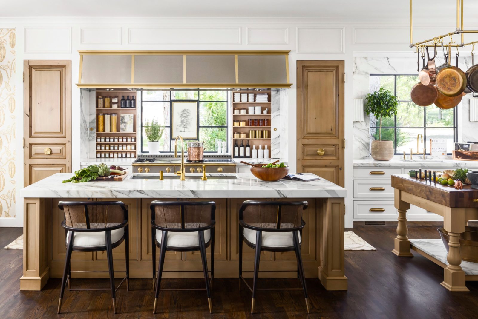
A kitchen does not need extra square metres to feel spacious or a complete renovation to look expensive. The strongest improvements usually come from better proportions, clearer sightlines, controlled colours, purposeful lighting and careful storage. When those elements work together, the room feels calmer, taller and more refined.
Luxury also depends less on price than many homeowners assume. A costly worktop cannot rescue a kitchen crowded with appliances, mismatched finishes and harsh lighting. By contrast, modest cabinets can look polished when their lines are clean, the hardware is consistent and every visible object appears intentional. The goal is not to fill the room with premium products. It is to remove visual friction and give a smaller number of details more impact.
The following ideas work for compact kitchens, open-plan spaces and older rooms that need an update. Some cost nothing beyond an afternoon of reorganising. Others require new lighting, joinery or surfaces. Start with the changes that correct the room’s biggest visual problems, then build from there.
1. Create Visual Space Before Changing the Layout
Visual space determines how large a kitchen feels before anyone considers its measurements. A room appears smaller when the eye meets clutter, strong colour changes, bulky furniture and rows of unrelated objects. Clearing those interruptions can change the kitchen more dramatically than moving a wall.
Begin by looking at the kitchen from its main entrance. The first view establishes the room’s scale and character. If the entrance faces a crowded worktop, an overflowing shelf or the side of a tall refrigerator, the kitchen immediately feels confined. Move loose items, simplify the nearest surface and give the eye a clean route towards a window, attractive backsplash or well-composed focal point.
Clear the worktops with discipline rather than removing every useful item. Keep out the appliances used almost every day, such as a kettle or coffee machine, but find storage for the food processor, blender and sandwich press if they appear only occasionally. Group the remaining items instead of scattering them across the room. A coffee machine, grinder and jar placed together read as one station; the same three objects spaced apart read as clutter.
Edit open shelves more aggressively than closed cabinets. Open storage can make a wall feel lighter, but only when the objects have room around them. Place everyday plates in neat stacks, repeat a limited range of colours and leave part of each shelf empty. Remove duplicate mugs, plastic containers and rarely used serving pieces from display. A shelf packed to its edges behaves like a solid cabinet with none of the calm appearance.
Control the number of materials visible at one time. Small kitchens often contain one finish on the floor, another on the cabinets, a third on the worktop, patterned tiles on the wall and several metals in the fixtures. Each transition divides the room into another visual block. Keep existing materials when they remain sound, but connect them through a restrained palette. Repeating the cabinet colour in the wall paint or matching the handles to the tap can make unrelated features feel planned.
Choose one main tone, one supporting tone and one accent. A warm white kitchen might use pale oak as its support and aged brass as its accent. A soft grey room might pair with dark timber and black metal. This simple hierarchy prevents every surface from competing for attention. It also makes future buying decisions easier because a new accessory either belongs to the palette or it does not.
Use contrast where it strengthens the architecture. Dark lower cabinets with light upper cabinets can ground the room while keeping the upper half open. A darker island can become a controlled focal point in a pale kitchen. Too many high-contrast edges, however, cut the room into smaller pieces. If the backsplash, worktop and cabinet doors all create bold boundaries, soften at least one of them.
2. Expand the Room With Colour, Light and Reflection
Colour changes the apparent boundaries of a kitchen. Pale tones reflect more light and reduce the weight of large surfaces, but pure white is not the only answer. Warm white, cream, light greige, soft taupe and muted stone can make the room feel open without giving it a clinical atmosphere.
Match the undertone of the paint to permanent finishes. A cool white beside a creamy worktop can make both surfaces look wrong, while a warm white may connect them. Grey floor tiles with blue undertones often work better with a clean neutral or soft grey than with yellow-based cream. Test large painted samples beside the cabinets, worktop and flooring at different times of day before committing.
Paint low ceilings in a light tone with enough reflectance to spread daylight. Using the same colour on the walls and ceiling can blur the boundary between them, particularly in a small or irregular room. If the walls carry a stronger colour, choose a lighter version of that shade for the ceiling rather than creating a sharp white line around the top.
Use cabinet colour to manage visual weight. Light upper cabinets recede more easily, while darker units feel heavier and closer. Homeowners who prefer dark kitchens can still preserve space by limiting the darkest finish to lower cabinets, an island or one tall storage wall. Consistent dark cabinetry can also work in a bright room, but it needs generous light and simple surrounding surfaces.
Layer the lighting instead of relying on one central fixture. General lighting should illuminate the room evenly, task lighting should brighten work surfaces, and accent lighting should add depth after dark. Recessed ceiling lights, a restrained pendant and under-cabinet strips can cover those roles without overcrowding the ceiling.
Place task lighting where the work happens. A ceiling light behind the person preparing food casts a shadow directly onto the worktop. LED strips fitted beneath wall cabinets solve that problem and reveal the full depth of the counter, which makes the surface appear broader. Choose continuous diffused strips so individual diodes do not reflect as a row of bright dots on polished stone.
Keep the colour temperature consistent across fixtures. Warm-white light around 2700K to 3000K suits many residential kitchens and complements timber, cream and warm metals. A slightly clearer 3000K to 3500K can suit crisp contemporary schemes. Mixing orange pendant bulbs with blue-white cabinet lights creates visual disorder and changes how the finishes appear.
Protect natural light by simplifying the window area. Heavy curtains, objects on the sill and tall plants can block more daylight than expected. Replace bulky coverings with a neat blind or simple treatment that can open fully. Clean the glass and keep the space directly in front of the window relatively clear.
Use reflective finishes in measured amounts. A glass backsplash, polished stone edge, satin cabinet front or metallic pendant can bounce light around the room. Covering every surface in gloss often creates glare and highlights fingerprints. One or two reflective materials usually provide enough movement while matt finishes keep the kitchen grounded.
3. Make the Kitchen Look Taller, Cleaner and More Expensive
Vertical lines give a kitchen height and authority. Cabinets that finish well below the ceiling divide the wall horizontally, collect dust and create an awkward area that is difficult to use. Extending new cabinets to the ceiling removes that gap and provides storage for occasional items.
Adding matching top boxes when replacing all the cabinets is unrealistic. A joiner can sometimes install shallow cabinets above existing units and paint them to match. Another option is a simple boxed-in bulkhead that closes the gap. The best choice depends on ceiling height, ventilation and the proportions of the current doors, but both approaches can make standard units look more integrated.
Select tall, narrow proportions for doors and panels. Vertical cabinet fronts lead the eye upwards, while rows of small horizontal doors make the wall busier. A tall pantry with internal drawers offers the clean appearance of one large door while keeping stored food accessible. Align neighbouring door tops and bottoms wherever possible.
Simplify the cabinet hardware to strengthen those lines. Slim bar pulls, small knobs or integrated handles create less interruption than ornate hardware in several sizes. Place every handle at a consistent height and orientation. Replacing dated handles is one of the least expensive ways to update cabinets, although old screw holes may limit the available sizes.
Coordinate the visible metals instead of matching every piece perfectly. A kitchen can combine stainless-steel appliances with brass lights and handles, but each finish should repeat with purpose. One isolated chrome tap among black fixtures looks accidental. Repeating chrome or stainless steel in another detail makes the choice feel connected.
Choose fewer and larger surfaces when renovating. A large-format backsplash contains fewer grout lines, and a slab backsplash can continue the worktop material up the wall. Larger drawer fronts also reduce the number of seams across the cabinets. These broad planes give the room a quieter, more substantial appearance.
Continue the backsplash beyond the minimum strip above the counter. Taking tile or stone to the bottom of the wall cabinets creates a complete field rather than a narrow protective band. On a wall without upper cabinets, extending the material to a shelf, extractor or ceiling can add height. Reserve that treatment for a controlled area so the material remains special.
Invest in one focal material rather than several weak statements. A strongly veined stone island, a handmade tile wall or a rich timber pantry can carry the design. Let nearby surfaces remain restrained. When expensive materials compete with patterned flooring, decorative lights and multiple cabinet colours, none of them receive enough visual space.
Upgrade the edges and transitions because small construction details influence perceived quality. Align the worktop overhang, keep silicone lines neat and finish exposed cabinet sides with matching panels. Fit fillers properly where cabinets meet walls. A modest kitchen with precise joints usually looks more luxurious than an expensive kitchen with uneven gaps.
Maintain the surfaces after the upgrade. Limescale on a dark tap, grease on cabinet fronts and stained grout quickly reduce the sense of luxury. Select materials that suit the household’s cleaning habits, not only its preferred style. Honed stone may hide reflections but require sealing, while glossy doors wipe clean easily but reveal fingerprints in strong light.
4. Improve Flow and Storage Without Rebuilding Everything
Good circulation makes a kitchen feel larger because people can move without navigating obstacles. Walk through the route between the entrance, refrigerator, sink and cooker. Remove anything that forces a sideways step, blocks a cabinet door or causes two people to collide during normal use.
Measure clearances before adding an island. A narrow kitchen may benefit more from an open centre than from extra storage placed in the walkway. If an island already feels oversized, consider reducing its depth, shortening one end or replacing it with a slim movable table. A peninsula can provide preparation space while using one fewer circulation edge.
Choose seating with visual and physical lightness. Backless stools can slide completely under a counter, while stools with slender legs expose more floor. In a kitchen diner, the narrow profiles found in well-scaled restaurant chairs can provide comfort without surrounding the table with bulky upholstery. Check seat height and allow enough space for people to sit without blocking the main route.
Create storage around the sequence of each task. Keep pans near the cooker, knives near the preparation area and mugs near the kettle or coffee machine. Store everyday plates close to the dishwasher so unloading takes fewer steps. A logical arrangement reduces the need to leave items on the counter because returning them becomes easy.
Use drawers for lower storage where the cabinets permit. Deep shelves force users to bend down and move front items to reach the back. Full-extension drawers bring the contents into view and use the cabinet’s depth more efficiently. Internal drawer dividers stop small tools from becoming another layer of clutter.
Add pull-outs to narrow gaps and tall units. A slim pull-out can hold oils, spices or cleaning products, while an internal pantry system makes deep storage easier to inspect. Avoid buying organisers before measuring the cabinet and listing what it needs to contain. Poorly sized accessories waste space rather than recover it.
Store items vertically when their shapes allow it. Dividers can hold baking trays, chopping boards and pan lids upright, preventing unstable stacks. A rail inside a cupboard door can organize clothes or small utensils if it does not collide with shelves. Hooks can help inside cabinets, but rows of tools hanging on visible walls often reintroduce the clutter removed elsewhere.
Build an appliance station if several machines occupy the counter. A cabinet with a lift-up or pocket door can contain the toaster, coffee equipment and blender while keeping them ready for use. Confirm ventilation, electrical access and manufacturer guidance before operating appliances inside a cabinet. Heat and steam need a safe route out.
Use corner cabinets according to what they genuinely store well. Rotating trays and pull-out corner systems improve access but can be expensive and may sacrifice capacity. Simple shelves may work better for large, infrequently used appliances. The correct solution is the one that prevents forgotten items from accumulating at the back.
Move the bin into an integrated pull-out if space allows. Waste and recycling containers take up valuable floor area and rarely improve the view. Position them near the main preparation zone and dishwasher, where scraps and packaging are handled. Choose a system with enough capacity for the household so it does not require constant emptying.
Protect uninterrupted worktop space. A narrow clear run is more useful than several small patches separated by appliances and decorative objects. Consolidate tall items at one end and keep the principal preparation area open. If sockets dictate appliance placement, an electrician may be able to relocate them during a modest update.
Treat the refrigerator as part of the cabinet composition. A freestanding model that projects far beyond shallow units can dominate a small room. Counter-depth appliances, recessed placement or deeper surrounding panels can reduce that effect. Confirm ventilation gaps and door swing before enclosing any refrigerator, as restricted airflow can impair operation.
5. Add Luxury Through Restraint, Detail and Maintenance
Luxury becomes convincing when the kitchen looks composed rather than decorated. Choose one focal point and let the rest of the room support it. A sculptural pendant above an island, a stone backsplash behind the cooker or a dark timber cabinet can provide identity without filling every surface.
Scale pendant lights to the room and the surface below. Large shades can make a small island feel cramped, while tiny fittings may look lost. Two medium pendants often create a cleaner rhythm than several small ones. Hang them high enough to preserve views across the kitchen and low enough to relate visually to the counter.
Style the worktops with useful objects in small groups. A timber board, ceramic utensil pot and bowl of fruit can add warmth without becoming a display project. Use a tray to contain bottles near the cooker or sink. The tray creates a clear boundary and makes the group easier to move for cleaning.
Introduce natural texture to prevent a pale kitchen from feeling flat. Timber, stone, linen, woven fibres and ceramics bring variation without adding loud colour. Use them where they make practical sense: a wooden stool, a stone bowl or a washable linen blind. Natural materials look strongest when they can age well and receive proper care.
Avoid small decorative signs and themed accessories. Written plaques, novelty containers and seasonal objects quickly crowd a compact room. Personal character can come from a framed print away from splashes, a handmade serving piece or a collection of ceramics edited to a consistent palette. One meaningful object has more presence than a row of generic decorations.
Refresh textiles as a low-cost finishing step. Replace worn tea towels, faded blinds and mismatched seat cushions with a limited set of colours and textures. Keep highly absorbent and washable fabrics near cooking areas. Long fabric panels close to an open flame or hot hob create an avoidable hazard.
Correct the details that make the room feel unfinished. Adjust misaligned cabinet doors, replace failing silicone, repair chipped paint and tighten loose handles. Hide cables, remove old adhesive hooks and touch up damaged skirting boards. These jobs are inexpensive, but together they change how carefully built the kitchen appears.
Create a simple cleaning routine for the most visible areas. Wipe the tap and sink after use, clear the main worktop each evening and clean cabinet fronts before grease builds up. Polish reflective surfaces with products suited to their finish. Regular light maintenance takes less time than restoring neglected materials.
Prioritise improvements in three stages if the budget is limited. Start with free changes: remove clutter, rearrange storage, clear the windows and edit the colour palette. Continue with affordable upgrades such as paint, handles, LED strips, textiles and coordinated accessories. Reserve structural spending for cabinets, worktops, flooring, appliances and electrical work that correct genuine problems.
Review every proposed purchase against the same questions. Does it improve storage, light, circulation or visual order? Does its colour or finish connect to something already in the room? Can it be cleaned and maintained without difficulty? If it answers none of those questions, it may add cost without making the kitchen feel larger or more luxurious.
A spacious, refined kitchen comes from a clear hierarchy. Open sightlines establish size, layered lighting adds depth, continuous surfaces reduce noise and accurate details convey quality. Start by removing what interrupts the room, then invest in the features that strengthen its proportions. The result will feel more generous because every visible element has room to do its job.
